Redesigning Netflix’s Browsing Experience
This case study breaks down how I redesigned Netflix’s browsing experience for their iOS app.
(Summer 2023)
Project Overview
Essentially, the purpose of the Netflix app on a mobile device is to use the Netflix streaming service. I was tasked to choose a digital customer experience that I was familiar with and to design and/or redesign that experience. I did just so redesigning Netflix’s browsing experience on the homepage by enhancing what was already there with slight changes. Below, you will find a current and future customer journey map that depicts the journey of a user through the current state of the app and their experience after my redesign.
The Problem
What is not working…
The main problems that I found encountering the app’s current design.
- The top of the homepage would have a random recommendation pop-up that takes up the entire screen.
- A new user trying to understand the full scope of the service may be challenged with the organization of movies and TV shows
- I text on the cover of the movie or show, varies in different fonts and sizes and can create a visual challenge
- Shows and movies the user has watched, using the service or not using the service may be a repeating recommendation throughout the categories
- After a selection, the trailer or preview begins to play automatically with sound (not a prompted choice by the user)
- The information given about the selection is vague and can create a feeling of risk in terms of investing time in the selection
These points are mapped out in the current state journey map I made using Figma. Here you can see the user’s journey from beginning to end, broken down by their actions, expectations, gain points, pain, points, mapped out, user feelings, and opportunities.

The Solution
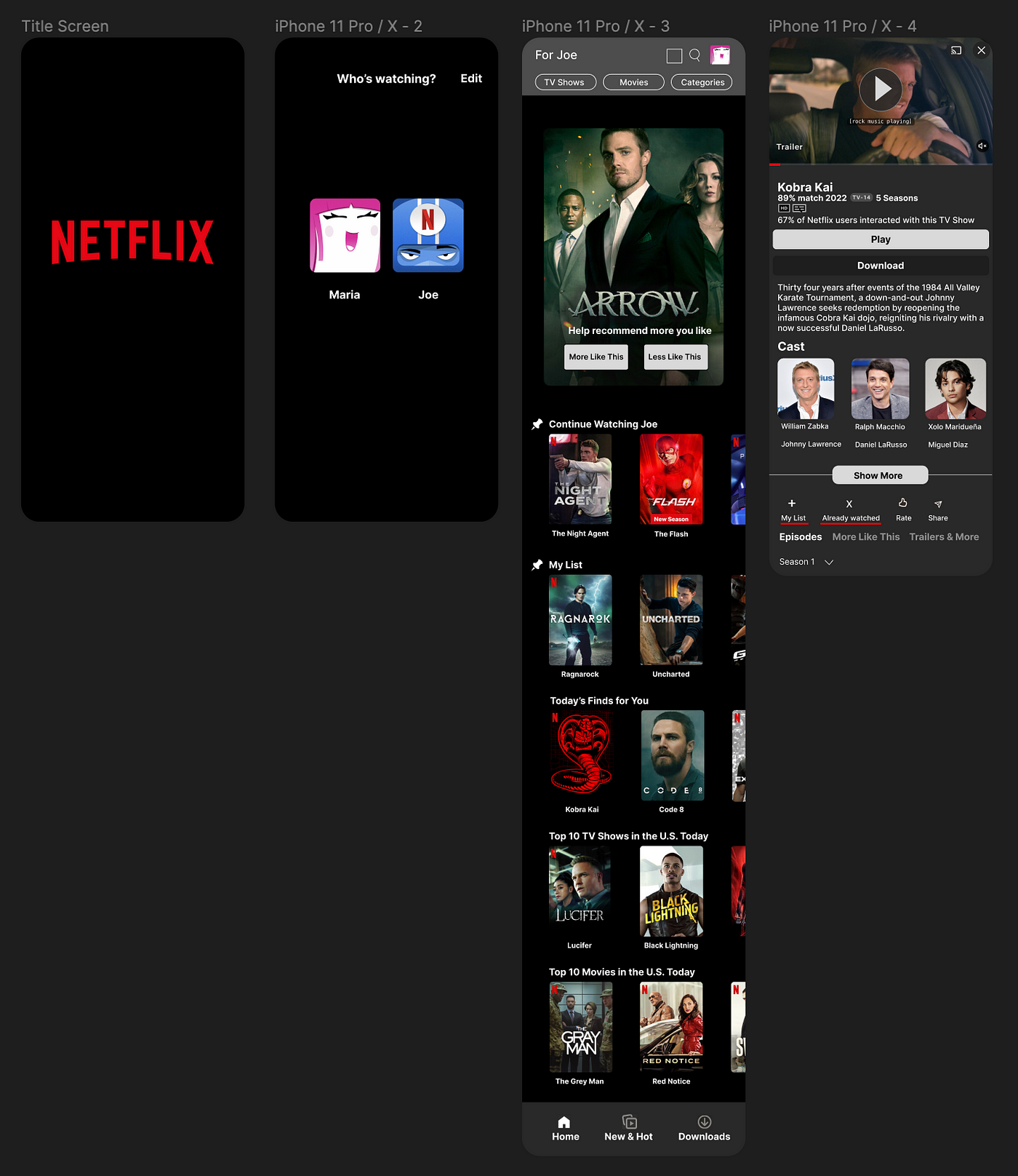
What you will see below is the prototype I created that displays my redesign of Netflix‘s browsing experience.

Here are the new features and design changes.
- At the top of the homepage, the random suggestion by Netflix was replaced with this new feature that allows you to help Netflix recommend more shows and movies that you would like based on the ones you’ve already seen. TV shows and movies that you have already seen or marked as seen will appear here. The part you play is selecting between the two buttons: “ More like this” to see more recommendations based off of the selection, or “ Less like this” to have a selection like the one in front of you to be less likely recommended.
- The second feature you will find is a solution to the organization and a vast amount of material presented at once on the homepage. Scrolling past the top of the homepage you were presented with a slew of categories. These categories may change in order every time you use the service. The feature that was added was a pin that you can use to keep certain categories at the top of your homepage.
- The third feature you will find is a solution to the font type and size variations on the covers. In this redesign, the TV show or movie title is now additionally presented underneath each cover.
- The fourth feature presents a solution to the automatic play and sound of a trailer or preview. Now an automatic pause when entering a selection is implemented along with a pause, and play button to allow the user to make their own choice.
- The fifth feature presents a solution to the vagueness of information presented in a selection. To solve that a more in-depth description is provided with an expandable cast list with photos, actor/actress names, and character names.
- Lastly accompanied by the traditional options, a new feature called already watched is presented. This feature complements the feature on the top of the homepage. Tapping the button insinuates that you have already watched the selection and would like to find more or fewer recommendations like the show using the homepage feature. This feature also helps ensure that it will not reappear or repeat as a recommended show for you in your categories presented on the homepage.
Now you may view a user’s experience with these features from the redesign in the future state customer journey map.

Go ahead and take a look through the map and notice the influx of game points and reduction of pain points in the user’s experience.
Results
Here is a side-by-side of the current and future state journey maps user’s feeling charts. Take a look at that increase in positive experiences.
Current state experience:

Future state experience:


